
Gaslighting made easy
By ASHMEDAI 15.06.2023
This is a ‘First Edition’ – it’s still a bit of a work in progress 🙂

“This work is truly a masterpiece of Soviet scholarship. It is so good in fact that I had the author sent to a Siberian Gulag in order that I could claim authorship.”
— Joseph Stalin
“The Idiots Guide to Cooking Data for Aspiring Propagandists is required reading for all WEF Young Leader’s Program indoctrinates. I can think of no higher praise.”
— Klaus Schwab
“As you know, I am Science. But if you want to know how Science is made, look no further than this brilliant, highly researched and purely evidence-based publication. I even have a copy on my nightstand signed by President Xi that he gave me to celebrate the opening of the Wuhan Institute of Virology!!”
— Dr. Anthony Fauci
“I can attest from my personal experience that everything in this book is true. Safe and effective, as you Americans like to say. How do you think I now have more money than Elon Musk??”
— President Volodymyr Zelenskyy, Democratic Nation of Ukraine
“Study protocols should be designed following the guidelines of The Idiot’s Guide to Cooking Data in order to maximize the impact of the study.”
— Excerpt from CDC Internal Memo ‘Re: MMWR Optimal Study Design’
Intro
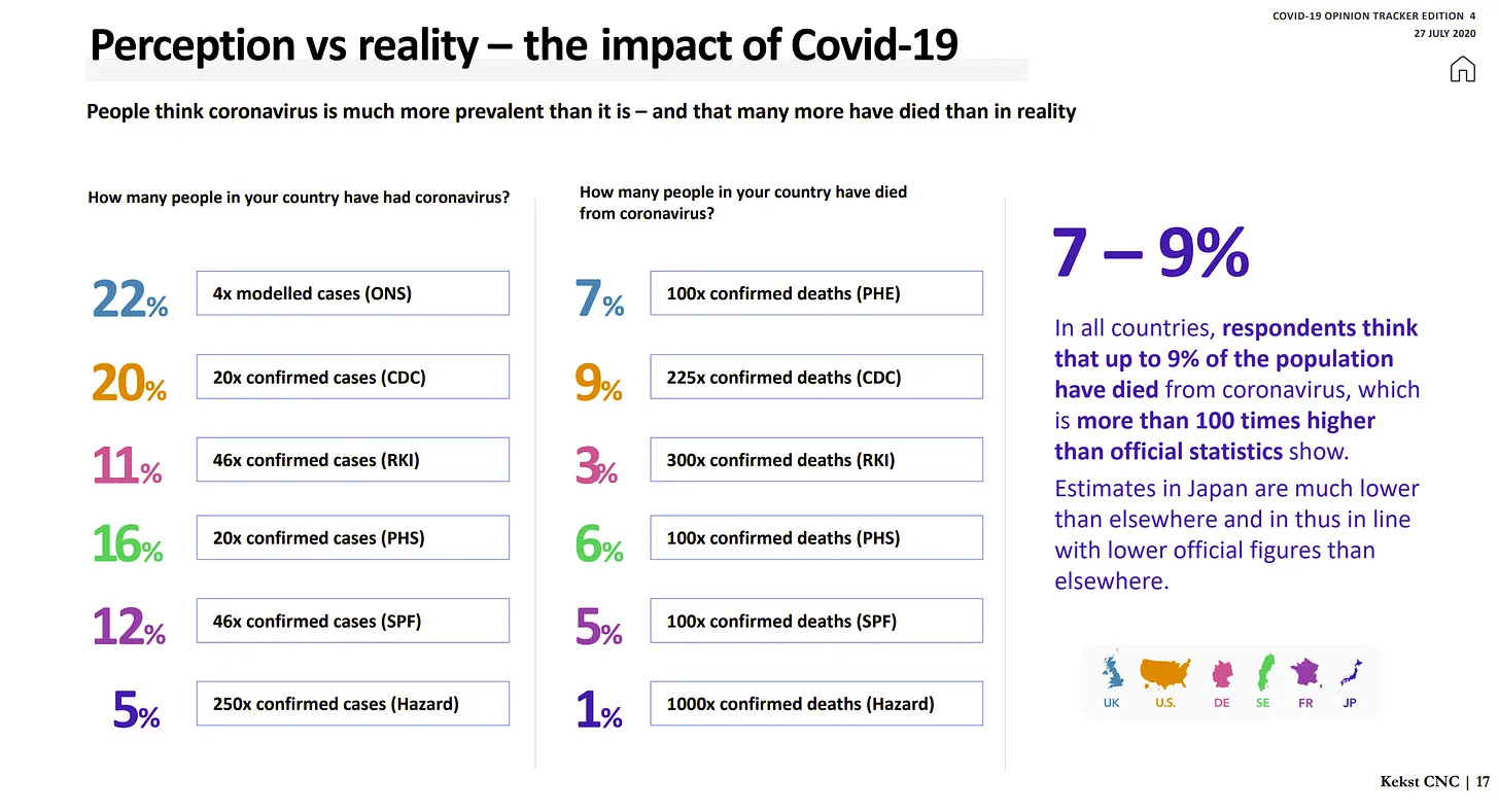
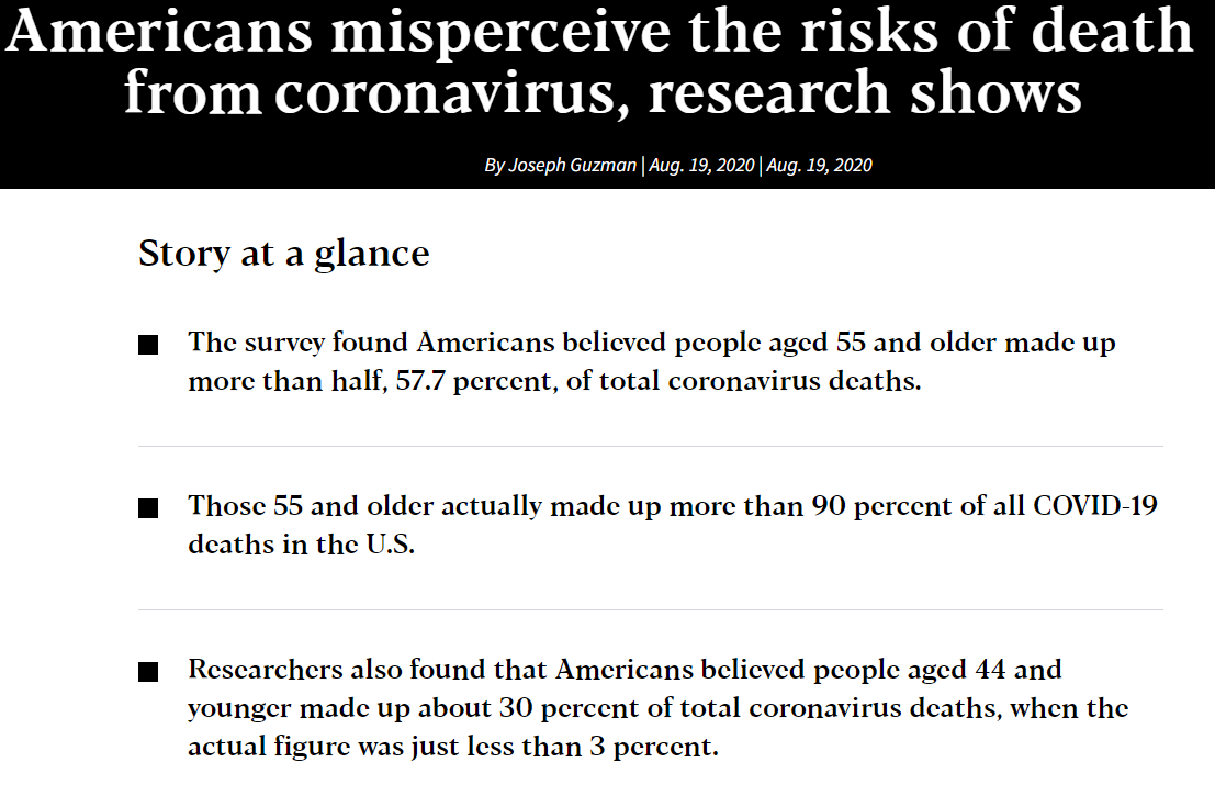
Take a close look at the above slide from an international poll conducted a few months after covid struck: This is what effective propaganda looks like. And the true effect was even greater, because the ‘real world’ numbers used to calculate how badly people exaggerated the risks of covid were of course themselves derived from. . . the world’s preeminent propaganda organizations (masquerading as public health agencies). Who were themselves already wildly exaggerating the risks of covid.
The art of effective propaganda is an encompassing discipline that requires careful and thorough study, and review from time to time. For the beginner, it can be very difficult to master. Even the experienced propagandist can at times fall into the trap of thinking that creating & disseminating propaganda is a straightforward enterprise – which is a good way to win an all-expenses paid Siberian vacation. It is not usually so simple a task to befuddle the entire society every day, 365 days a year, indefinitely.
The following short guidebook will provide the aspiring propagandist, WEF lackey, Communist, Woke Marxist, and seasoned government bureaucrat alike with the tools and knowledge necessary to develop their promising talent into full-bloom mastery of the art of propaganda.
This book is a bit long, do not feel as though you must read it start to finish in one shot, for that is a recipe to burnout & to not retain the critical information contained within.
This manual is divided into the following sections:
Section I. Definitions – How to redefine words, terms, and metrics to keep them in line with the regime narrative
Section II. Curating Data – How to hijack the processes of recording, reporting and publishing data
Section III. Vetting which data are considered to be part of Official Science – How to vet and data and dispose of regime non-conforming data so it never appears in any Official Science or regime datasets
Section IV. How to rig a study – Exactly what this sounds like
Section V. Doctoring the datasets – Sometimes, you will need to go in and do a little ‘surgery’ to modify the content of databases you can’t simply eradicate but that contradict regime talking points
Section VI. Control the standards of evidence – How to set up a hierarchy of evidence that puts regime-friendly Science at the top and regime-unfriendly science at the bottom (of the Marianna Trench)
Section VII. The Ecclesiastical Authorities of Science – How to ensure that Scientific Authorities reliably parrot the regime’s facts and narratives
Afterword – Tying it all up nicely, like one of Peter Hotez’s bowties (he’s a really annoying Regime Celebrity Scientist)
Section I – Definitions
“He who controls the language controls the masses”
Saul Alinsky, Rules for Radicals
How we define concepts or categories determines what tidbit of the real world they communicate or represent – or what they don’t communicate or represent.
Malleable definitions, and an arbitrary and capricious standard for assigning definitions, are an absolute must for any effective propagandist. Despite the best efforts, even seasoned, expert propagandists will inevitably confront situations where the curated data that exists or people’s individual experiences are problematic to the official regime narrative.
Effective propaganda therefore requires the capacity for nimble and highly adaptive flexibility to control the content of data, especially pre-existing conventional metrics that the public is accustomed to hearing about which are notoriously difficult to simply make disappear (unlike the ease by which you can vanish a dissident scientist off of YouTube or Facebook). For example, you won’t be able to avoid talking about “deaths” in the context of a novel Dreaded Disease – the primary way people will relate to gauging the severity of a disease will always be first and foremost “how many people died from the disease” – but you can change what “death” refers to in the context of the novel Dreaded Disease if you want to increase or decrease people’s sense of how deadly it is.
In practice, this means that when the normal understanding of a term or concept shows that the reality does not quite fit the regime’s desired narrative, just change a few definitions and presto, problem solved.
As many a prominent communist propagandist throughout history has also observed, “He who controls the language rules the world”.
There are a variety of ways to alter or transition definitions to more acceptable versions:
I-1. Limit a definition
If the conventional definition of something includes data or information that is at odds with regime dogma, limit the definition so it no longer includes the unwanted information. There are plenty of ways to do this. The following are a few of the more common types of characteristics you can use to effectively limit a definition:
- Limit the definition by time interval: Suppose that vaccinated people get the Dreaded Disease at very high rates in the first 30 days following vaccination, and after 90+ days from vaccination, with the Glorious Vaccine. This is a big problem, because people will think that the Glorious Vaccine is not effective:
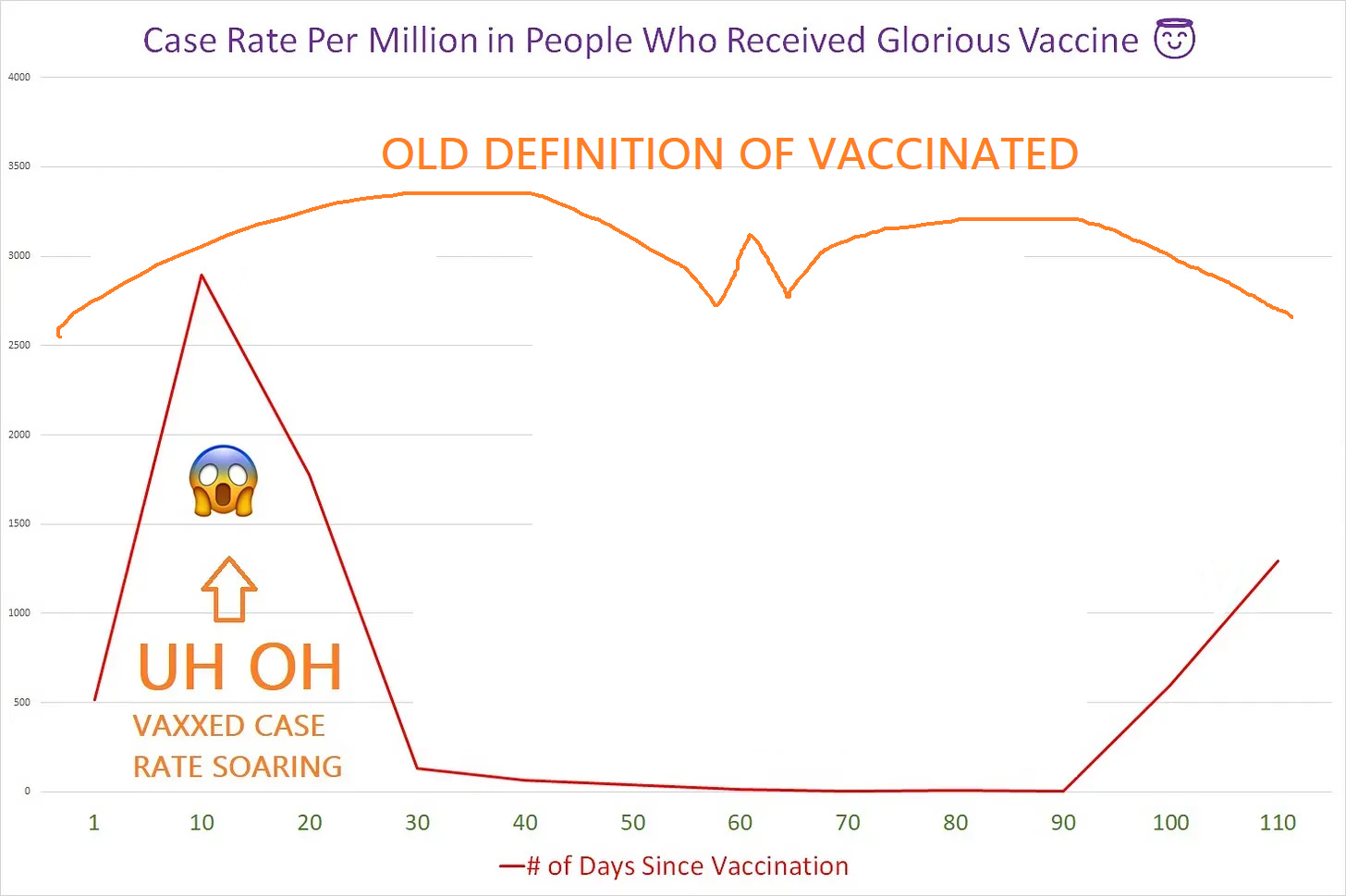
In plain English, what you see on the above chart is that the number of cases per million people goes as follows:
- Before vaccination: 500 cases of Dreaded Disease / million people
- 10 days after vaccination: 3,000 cases of Dreaded Disease / million people
- 20 days after vaccination: 1,700 cases of Dreaded Disease / million people
- 30 days after vaccination: 100 cases per million people
That’s very inglorious efficacy for the Glorious Vaccine – something that cannot be allowed to stand. The solution is to simply change the definition of ‘vaccinated’ to mean someone who is between 30 & 90 days after being injected with the Glorious Vaccine – in other words, anyone who is within 30 days of being vaccinated, or after 90 days from vaccination, is not considered ‘vaccinated’:
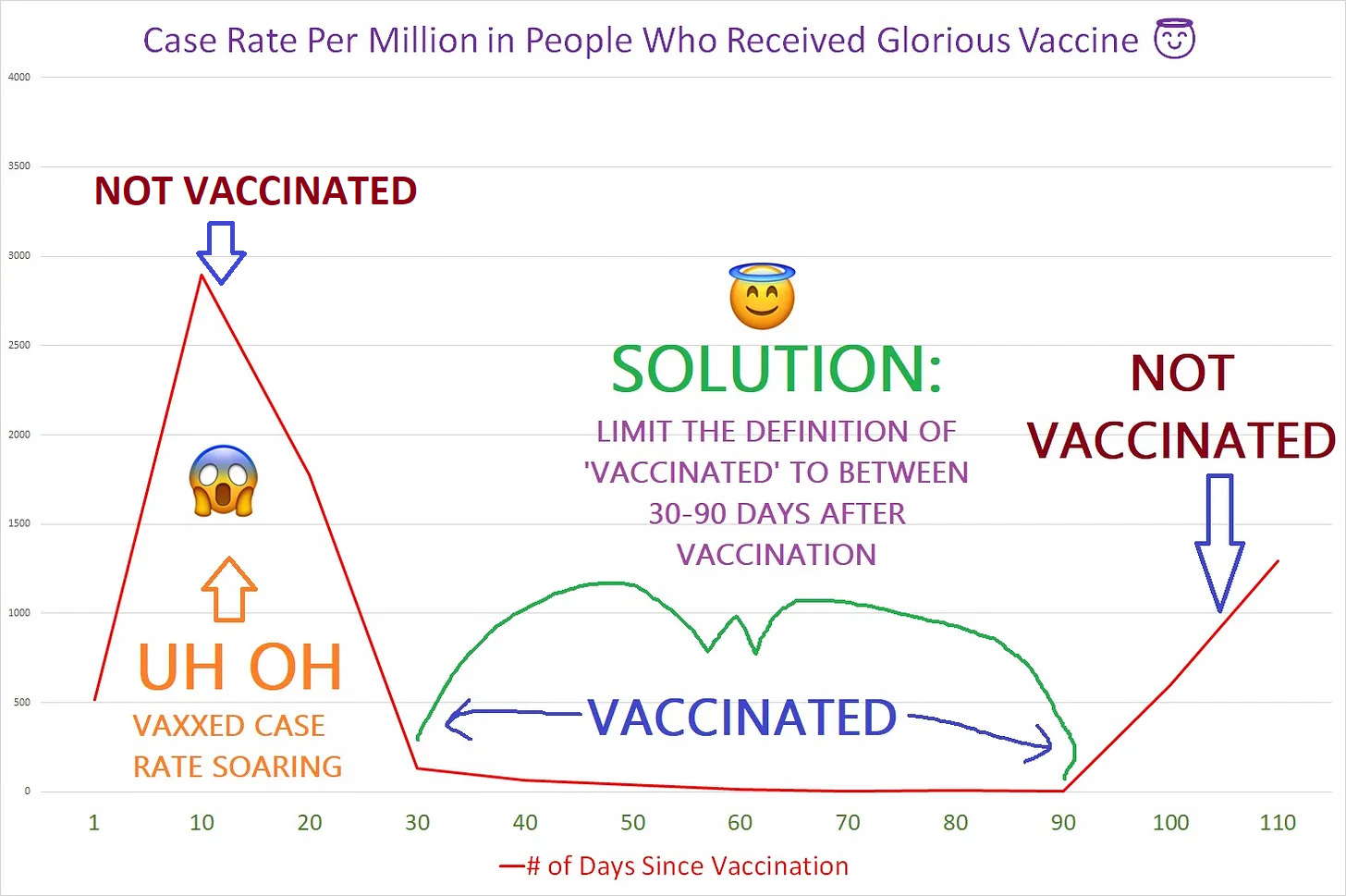
This particular tactic was pioneered by pretty much every public health agency in the civilized world, where the definition of ‘fully vaccinated’ for the covid vaccines was limited to “14 days after your second dose”:

- Limit the definition by quantity, such as the number of exposures – for instance, if a bunch of people who received 1 dose or 5 doses of the Miraculous Treatment Mirafaucivir died (1 dose because it’s ineffective, and 5 doses is too toxic), limit the definition of ‘treated with MiraFaucivir’ to between 2-4 doses:
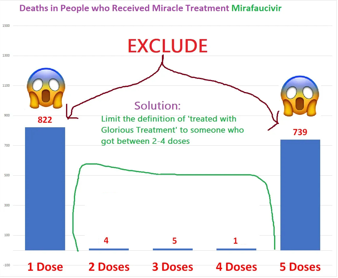
An added benefit here is that by excluding people who only got one dose, you’d be excluding most of the people killed by MiraFaucivir – the people who are the most susceptible to getting killed by MiraFaucivir tend to be killed by the first dose.
- Limit a definition by adding absurd conditions into the definition that are almost impossible to fulfill. For instance, you might try using the following conditions to limit the definition of a ‘vaccine death’:
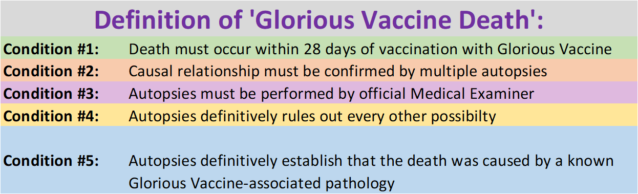
It’s pretty hard to ever manage to get a ‘confirmed’ case of someone dying from the Glorious Vaccine under conditions like these.
(You must remember to obstruct autopsies as much as possible to make this example definition fully effective.)
I-2. Expand a definition
Conversely, sometimes you may want more of something than there actually is. Expanding definitions is a great solution – just reverse the above instructions for limiting definitions.
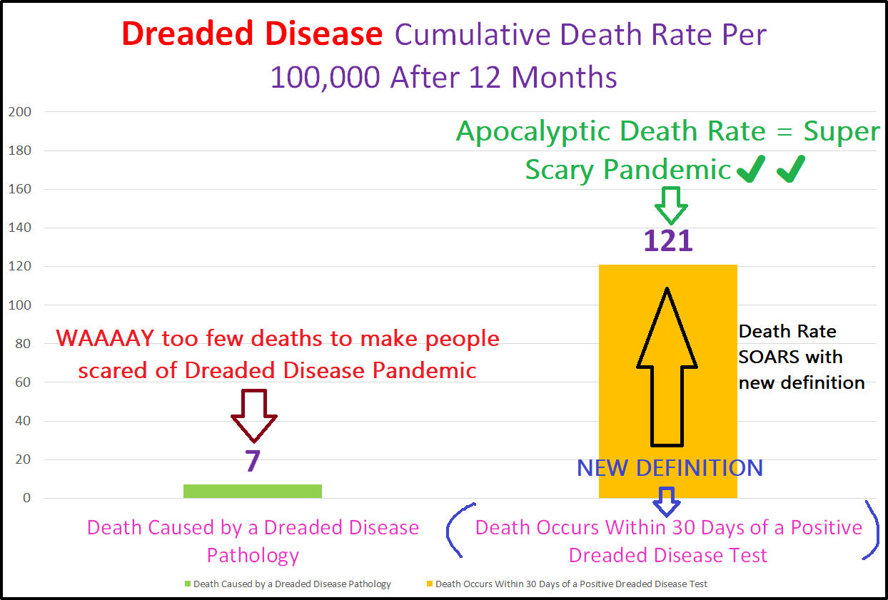
For example, if you need more deaths from the Dreaded Disease than there are people actually dying because of the Dreaded Disease, you can expand the definition of a ‘Dreaded Disease Death’ to ‘any death within 30 days of a positive test’, and presto you have a full-scale epidemic on your hands.
For example, suppose that after 12 months of Dreaded Disease circulation, only 7 people per 100,000 were actually killed by the Dreaded Disease – not exactly scary. You can pull a little switcharoo and expand the definition of a ‚Dreaded Disease Death’ to something like what the CDC pulled – “any death within 30 days of testing positive for the Dreaded Disease”. Look at what a difference it can make:
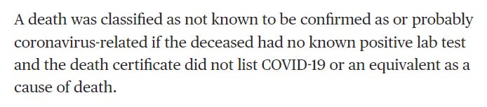
New York State offers a classic illustration of how to expand the definition of “Dreaded Disease Death” to create the appearance of a once-in-history super duper scary apocalyptic pandemic – just look at the following gorgeous open-ended definition for a ‘probable’ covid death:
NOTE OF CAUTION: You must always take care to NEVER, EVER, EVER – EVER!!! – articulate to the public how you’re gaslighting them in clear, concise language that they will understand.
This unforced blunder from Illinois Public Health Director Dr. Ngozi Ezike is the sort of thing that gets you a quick one-way ticket to the Gulag (see below) – she actually said the following at a public press conference (see embedded video below):
„So, the case definition is very simplistic. It means at the time of death, it was a COVID-positive diagnosis. So that means that if you were in hospice and had already been given a few weeks to live and then you also were found to have COVID, that would be counted as a COVID death. It means that, technically even if you died of a clear alternate cause, but you had COVID at the same time, it’s still listed as a COVID death.“
😱😱😱😱😱😱😱 😱😱😱😱😱😱😱
She was doing the right thing of course by using such a wonderfully expansive definition for covid deaths, but she stupidly and carelessly let the cat out of the bag for the whole world to see. That’s the kind of unforced error that can demolish an entire propaganda campaign overnight, and also the kind of thing that can be a career-ender:

I-3. Invent a brand new definition
Sometimes it is simply not possible to play with the definition at the margins in a way that will work. In that case, you can take the gutsy step of redefining the concept or category altogether to fit your propaganda needs. Just beware that it may be a tad more difficult to convince people that the old definition is a figment of their imaginations.
Take the CDC (yup, we’re gonna be quoting CDC a lot, they are the preeminent health propaganda organization in the world after all), which changed the definition of ‘vaccination’ multiple times over a span of 6 years:
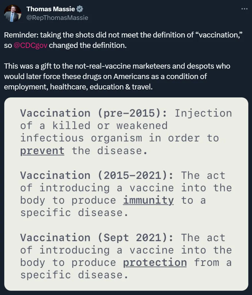
Sidebar: The above tweet offers a lesson in the need to control rogue legislators who might try to dissent and even to expose your propaganda efforts. You don't need the additional headache of dealing with clear evidence of your linguistic treachery broadcast to the public from the floor of Congress or Parliament (or the even bigger headache of being banished to Siberia as the fall guy for allowing such a thing to happen).
On occasion, you may find that you are trapped by the ordinary conversational meaning of words, where they highlight something you can’t afford people paying attention to. Should this occur, you will be forced to implement a fundamental change to the very essence of the language. This is a sort of nuclear option for when you can’t hide something any other way, and also can’t afford to not hide it (but beware, such an audacious endeavor comes with a significant degree of difficulty as many people will be inclined to resist such open and bold language transitioning – like many resist going along with gender transitioning).
For example, take the term “peaceful protest”:
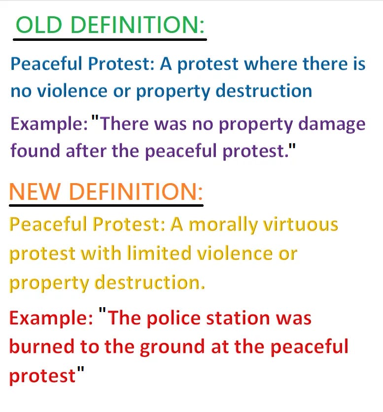
Of course, ‘limited’ is a subjective term whose precise contours are ill-defined, which gives you a lot of latitude to apply the description to almost anything regardless of how incoherent or misfit the application is, as evidenced by this real-life media report that needs no further description:

I-4. Combine Categories
Sometimes, it just isn’t practical or feasible to mold the data simply by changing definitions. Not to worry though – if you can’t change the definition, you can instead change the datapoint or category itself that folks are used to the word or phrase referring to. People aren’t attuned to subtle or nuanced differences in categories or datapoints, and the media helpfully conflate most things anyway, making this an easy and convenient trick. For instance, you can try:
- Combining different age groups:
Suppose the Glorious Vaccine is causing a bunch of kiddies to turn into zombies. That’s pretty bad for the regime. (Which means you should reassign a few scientists to work at a Siberian climate research station for the remainder of their careers. Without socks.)
First, you must always refer to this novel condition as “Safe & Effective Transformation into Carnivorous Zombie”. The reason for the carnivorous part is simple: ‘flesh eating zombie’ sounds too scary, and plain ‘zombie’ feels like the the zombies are basically dead – i.e. the precious kiddies are dead – neither of which you want people to come away with an impression of.
Second, seeing as this increase is obvious to anyone who looks at the data (see below), you will have to deal with that. However, instead of presenting the data broken down by age, where people will immediately notice the surge of kiddie zombification, present the data as a combined age group that is big enough to hide or launder out the signal:
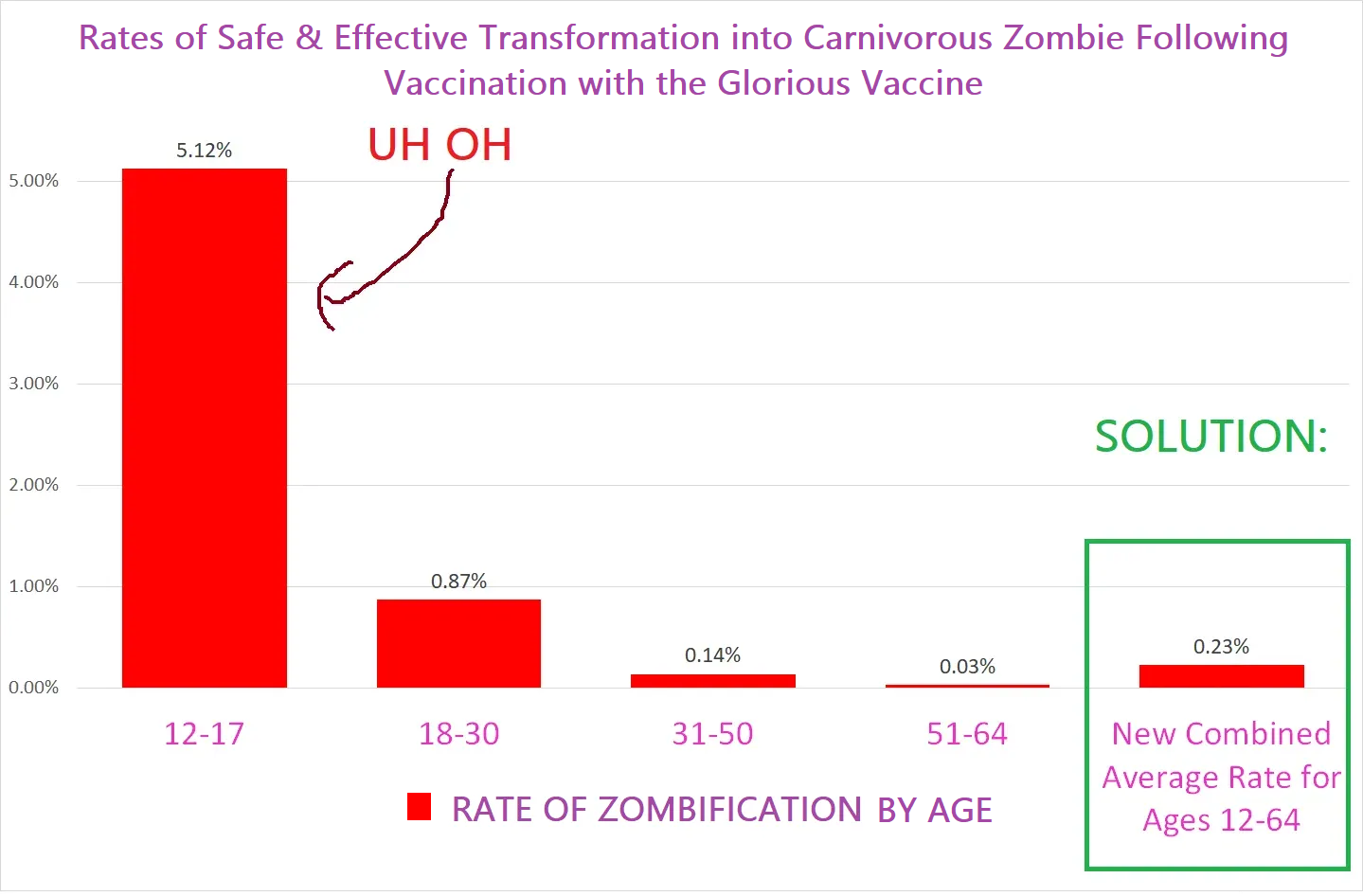
What you are doing in essence is taking the term “rate of Zombification after the Glorious Vaccine” which can be used to refer to the various different age groups & making it refer to the rate of all age groups combined.
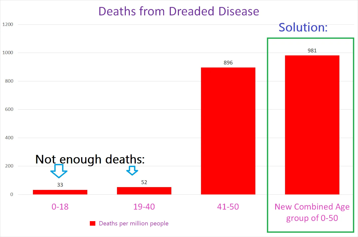
Now, nobody will notice that the data shows a clear risk to kiddies of being turned into carnivorous zombies by the Glorious Vaccine. Or conversely, suppose that the youngsters aren’t dying from the Dreaded Disease at high enough rates to scare the mommies, you can present Dreaded Disease death data from a combined age group of 0-50 that makes it seem like there are soooo many deaths from a group that includes the kiddies:
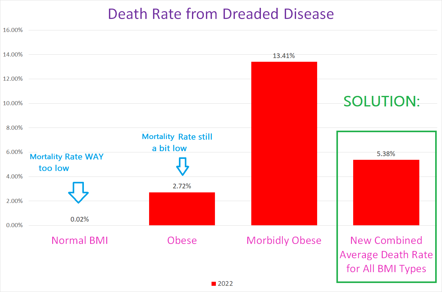
- Combining different demographic cohorts: Same idea as the age groups, suppose you need to avoid the citizens figuring out that the Dreaded Disease is really only dangerous to the morbidly obese people – which is bad firstly because then they won’t be scared of the Dreaded Disease & secondly because people might start to question whether fat is healthy, which you can’t allow because they might begin to question the regime narrative regarding ‚fat positivity’ and then who knows what else afterwards. Just present the Dreaded Disease death data using a combined category that covers all types of weight identities:
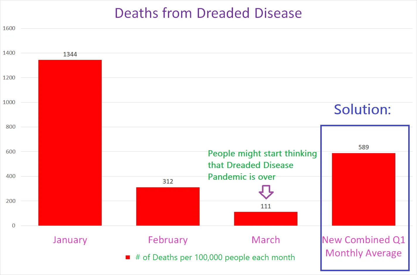
- Combining different time periods Suppose you notice that the deaths from the Dreaded Disease are decreasing month over month – which can be catastrophic to regime plans that require the people to believe that the Dreaded Disease is in full circulation for another few months. If the people get the idea that the Dreaded Disease is winding down, well, that’s a lot of lost opportunity to use the Dreaded Disease crisis as a means of effecting societal transformation to consolidate and solidify the regime’s power.
So instead of presenting the death data by month, combine all three months into a new category of “monthly average over the three months” which will mask the decrease from January to March, illustrated below:
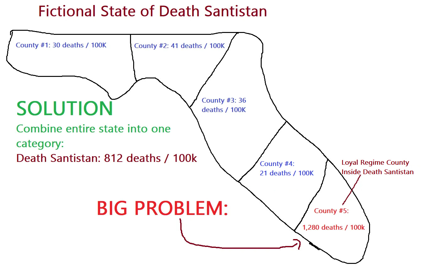
- Combining different geographical jurisdictions Suppose that there’s a rogue state within the country that is making problems for the regime that doesn’t follow regime guidance for dealing with the Dreaded Disease. If they show better or even equal results to the ret of the country where they are good citizens and follow regime guidance, that would be pretty bad. Suppose further that there’s a city or county within this bad state – which we’ll call Death Santistan – there’s a loyal regime county that follows all regime guidance but their death rate is much higher than the rest of Death Santistan. Very very bad. Solution? You can present data from the entire state so people can’t tell that the loyal county following regime guidance has a death rate 10 times the rest of the state. There’s even a bonus benefit: you can point to the whole state of Death Santistan as a failure because the loyal regime county will make the whole state look much worse!!
- Combining all the cities and counties in a disloyal state to hide the problems unique to loyal regime cities is one of the go-to propaganda tactics used to try and hide the vastly higher crime rates in regime-loyal cities (high crime rates is a good thing of course that is a deliberate choice of the regime by design – high crime rates are useful for the regime because instability makes people more willing to accept tyrannical government as a solution).
To illustrate, here is a brilliant piece of gaslighting from one of the mainstay regime media mouthpieces:
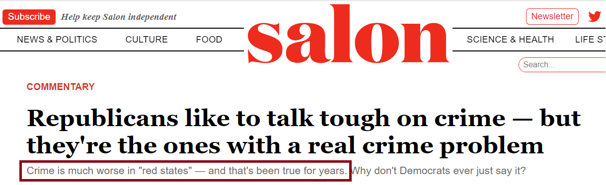
Look at the subtitle in the crimson box – see how they adroitly finger the red statesfor the high crime rates that are all in the blue cities but not in the rest of the state where the governance is “red”? Exactly.
- Combining different types of the effect or phenomenon. For instance, if there is an increase in a specific subtype of disease condition – like alarming increases in rare cancers following the rollout of the Glorious Vaccine, which might make people question the official regime narrative that the Glorious Vaccine is the safest entity ever created or discovered in universal history – you can use the general category of cancer – which is 1,000x as big – to hide the signal.
Another way to think of combining categories is that you never give out the specific data for different groups, something that was pulled off to absolute perfection when covid struck. Consider the following polling results, showing the share of covid deaths side by side with the % of each age group who were worried they would be killed by covid. (The blue bars show the % of each age group who were worried about getting killed by covid, the green bars show the % of the total number of covid deaths that were in each age group.)
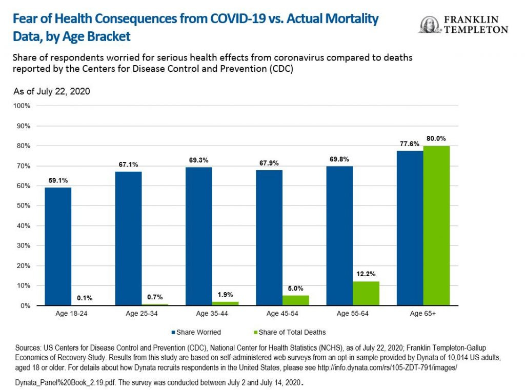
Had people understood what their actual risk of dying was, the blue bars should be at least in the ballpark of the green bars. When the blue bars are dramatically higher, that is the results of brutally effective propaganda by combining all age groups into one category without ever differentiating:
Smashing success indeed!!!
I-5. Split categories
Sometimes you will need to split up a category instead of combining it with another one. Just reverse the framework laid out above for combining categories.
This neat little maneuver is especially useful when you need to get something below the threshold for statistical significance.
Let’s explain how this works. Statistical significance as used in conventional academic/scientific language basically means that the likelihood of something is not due to random chance is less than 5%.
If you flip a coin 10 times, the odds of getting 7 heads because of random chance is 11.72% – NOT statistically significant. If you flip a coin 100 times, the odds of getting 70 heads because of random chance is a miniscule 0.0023% – VERY statistically significant.
Why is this? To get 7/10, all you need is two extra coin flips to go your way – going on a bit of a streak. Small deviations like this can easily happen at random. However, to get 70/100 requires 20 extra coin flips to go your way – the odds of getting *20* extra coin flips by random chance are negligible, so if we see 70 heads out of 100 flips, we can presume that there is something fishy going on, because that’s very very unlikely to happen by random chance.
You can use this to your advantage to divide and conquer a statistically significant signal – you can divide a category where there is a statistically significant signal for something against regime doctrine into smaller categories in order to break up the signal from a ‘70/100’ into a bunch of ‘7/10’s that are individually not statistically significant.
So if for example there is a signal that there are more deaths per 100K per year after the Wondrous Glorious Vaccine Campaign, you can publish the death data broken down by age group where no one age group will show a statistically significant increase in deaths (and you can claim that it’s probably leftover excess death from ‘Long Dreaded Disease’ from complications of getting the Dreaded Disease):
Note of caution: This particular tactic should ideally be combined with something else, otherwise people could reverse engineer the breakdown by doin a bit of simple arithmetic to add all the age groups together. So make sure to add in other confounding tricks.
I-6. Redistribute / redraw categories
A more finely tuned alternative to combining categories outright is to redistribute them – to redraw the lines so to speak. This can be done using any characteristic by which categories are differentiated.
For example, returning to our example of the evil disloyal state of Death Santistan, instead of combining the entire state into one statewide statistic, you can surreptitiously redraw the geographic boundaries of the counties inside the state for the purposes of Dreaded Disease data like this – look at what happens when we change the county borders to the green lines:
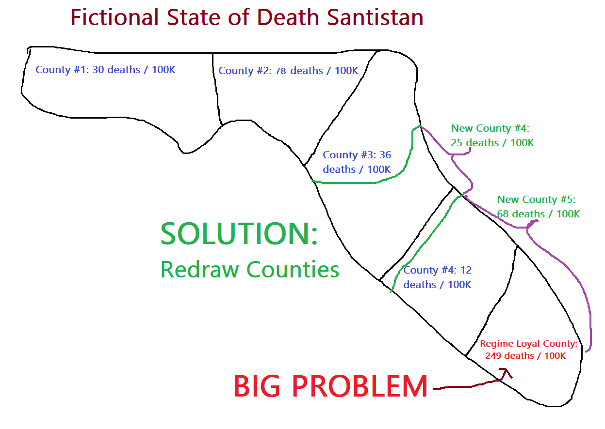
Note:This does not mean you have to literally redraw the counties for political and other purposes like voting districts, all you’re doing is using different borders for the sole purpose of Dreaded Disease statistics. (The population however will assume that you mean the actual counties that exist and will therefore not realize you pulled a fast one over them. It’s called propaganda for a reason.)
I-7. Fluid definitions
There are times when you may have the paradoxical need to use a specific definition for one thing but must also avoid that specific definition for something else. For such cases, you must act like a dictionary – dictionaries typically have multiple distinct definitions for one word, you can do the same.
For instance, the word woman is sometimes defined as ‘an adult human that possesses female anatomical and genetic characteristics’, such as when discussing a ‘woman’s right to choose’; and is sometimes defined as ‘one who identifies as a female’, such as in the context of civil rights.
Section II – Curating Data
Even better than plying malleable definitions is to avoid situations that require definition-shifting in the first place.
The best way to head off such issues is to curate the data in a way that avoids creating potential headaches, by employing one or more of the following tried and tested methods for corruptly hijacking the data curation processes:
II-1. Don’t diagnose or identify something
If a patient comes in suffering from multiple neurological deficits after taking the Glorious Vaccine and gets sent home with a Xanax prescription for his “anxiety”, it won’t generate a diagnosis for a neurological deficit in the first place in any database. No diagnosis of a condition that could’ve been caused by the Glorious Vaccine – or diagnostic ICD code – means you will won’t have to employ definitional sleight-of-hand to cover up the existence of diagnosed injuries associated with the Glorious Vaccine. Thus you should ensure the people responsible for diagnosing or identifying problematic or contradictory data/observations to the Perfectly Safe & Effective Glorious Vaccine will avoid doing so.
It is worth emphasizing here that patients are easily gaslit by their own physicians that ‘it’s all in their head’, even when they know they have serious medical injuries.
Let’s illustrate this with the following hypothetical scenario:
Regime officials see that in the government-controlled PROPAGANDA Safety Surveillance Database set up to monitor Glorious Vaccine safety
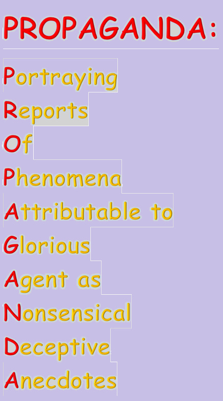
– there is a signal for VAMP Syndrome (Vaccine Associated Metamorphological Phenomena) conditions:
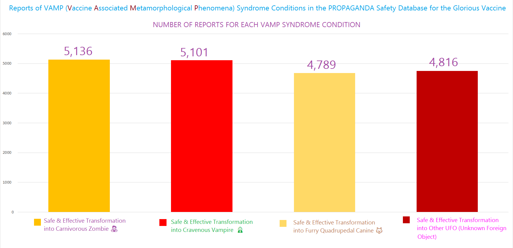
A patient comes in presenting with rapid, acute onset of Renfield’s syndrome (thirst for blood), extreme photosensitivity, pronounced macrodontia, and severe Contact Dermatitis to silver that all began within hours of getting jabbed with the Glorious Vaccine. This is an obvious case of a VAMP Syndrome side effect – the patient’s presentation fits the diagnostic criteria for fully-fledged vampirism & the condition was caused by the Glorious Vaccine (since you the doctor can safely rule out any other cause & the immediacy of the onset of VAMP symptoms after getting jabbed is a pretty self-evident indicator that the Glorious Vaccine did it).
Even though the patient can see that they are clearly not right – they feel an overwhelming temptation to chomp down on your pulsating jugular vein, they can’t stand being in front of a window unless the shades are completely drawn shut, they accidentally bit off a few pieces of their tongue with their newly extra-long and razor sharp front teeth, and their skin starts peeling if they touch the silver family heirlooms – so what?? You can still tell the patient “this is in your head” & send them home with a Xanax prescription (and maybe a bag or two of O-Neg blood if you sense that the patient might not be able to control themselves much longer & you don’t want your jugular to supply their lunch). And the patient will actually just accept it & go home without much of a fight.
This neatly avoids even generating any diagnostic record of VAMP Syndrome altogether, so there’s nothing to show up in any database anywhere.
You’d be surprised at just how many doctors are compliant to the point that they will convince themselves that the furry woman with a tail that grew out of nowhere an hour after getting the Glorious Vaccine has nothing whatsoever to do with the Glorious Vaccine.
II-2. Over-diagnose or over-identify something
Conversely, if you need to make more of something than there is readily available, simply reverse #1. For instance, if you need people to be more fearful of the Dreaded Disease, you can implement a mass-testing regime to juice up the number of ‘confirmed’ cases of the Dreaded Disease. Also make sure to use tests that will return very high rates of positives, whether they’re true or not.
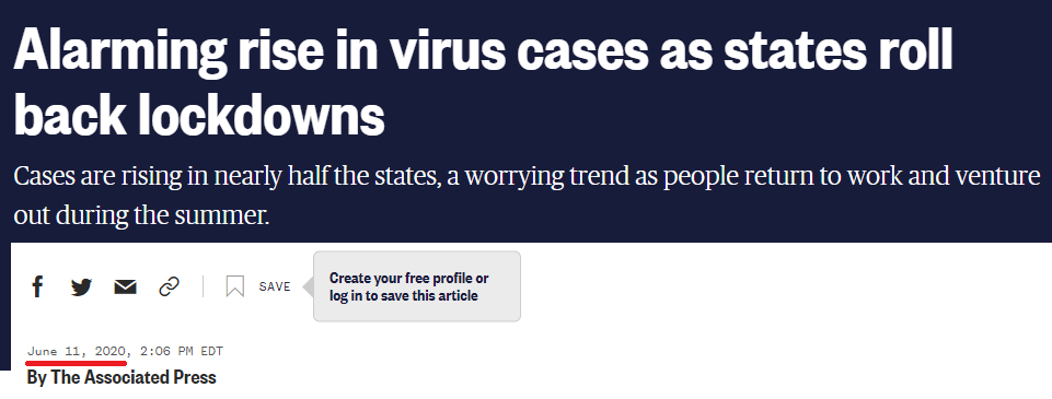
By increasing the surveillance or testing for something, you can generate the appearance of increasing numbers of whatever you’re testing for, or at least maintain the façade that it’s still around. Consider the following illustration from the good old USofA – you can see on the top chart that as the # of daily covid tests went up, at the same time that the % of tests that were positive plummeted more than 75% (bottom chart). What this managed to do was keep those case numbers relatively high (middle chart) – even as the % of tests that were positive went down >75%, the number of new cases only decreased about 25% during that same time period.
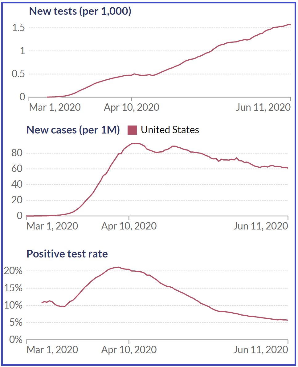
The meaningless increase in the raw number of cases that was entirely a function of more testing resulted in headlines like this great NBC panic porn piece published on June 11, 2020:
Always remember: you find what you look for, and you find more of what you look for more.
II-3. Don’t report what is diagnosed or identified
Sometimes it isn’t possible for to avoid diagnosing or identifying something best left undiscovered. In such a case, you can at least make sure that what was observed isn’t included in official reports or data:
At a more individualized level, you should issue guidance to the doctors and medical personnel on the ground NOT to diagnose things you don’t want showing up in datasets. Don’t hesitate to use financial incentives to sweeten the pot for loyal regime-compliant doctors.
And even in those rare cases where a doctor cannot avoid diagnosing a patient with a severe condition that occurred right after taking the Glorious Vaccine, the doctor can still make sure to avoid reporting the adverse event to any database of Glorious Vaccine injuries.
Alternatively, if the regime database for documenting injuries from the Glorious Vaccine somehow still ends up containing too many problematic reports where it is casting doubts upon its safety, there are two things you must do.
The first is to strand a few of the database administrators on the coast of Somalia so the rest of them get their act together and stop letting so many reports get through. You’re paying them to do a job, which is to maintain the public perception that the Glorious Vaccine is the safest drug product ever invented; failure is not acceptable.
The second is to NOT publicly disclose the problematic reports in the database. The CDC tried their darndest, but were ultimately defeated by a rogue judge (which emphasizes the need to control the judiciary as well):
Last year, I wrote to let you know that the CDC was refusing to release its post-marketing safety data for Covid-19 vaccines from its v-safe system to the public, despite our legal demands for this data on behalf of the Informed Consent Action Network (ICAN).
https://aaronsiri.substack.com/p/v-safe-part-1-after-464-days-cdc?utm_source=substack&utm_campaign=post_embed&utm_medium=web
II-4. Don’t allow investigation of phenomena if the findings might cause problems
The flip side of “you’ll find what you look for” is that “you won’t find what you don’t look for”, so make sure nobody goes looking for potential signals of something that could be problematic for the regime narrative. If, say, the regime ‘accidentally’ unleashes a plague in a third world city, you can’t have pesky social media conspiracy theorists figuring out what happened, so you best make sure that nobody conducts autopsies or tests sick individuals.
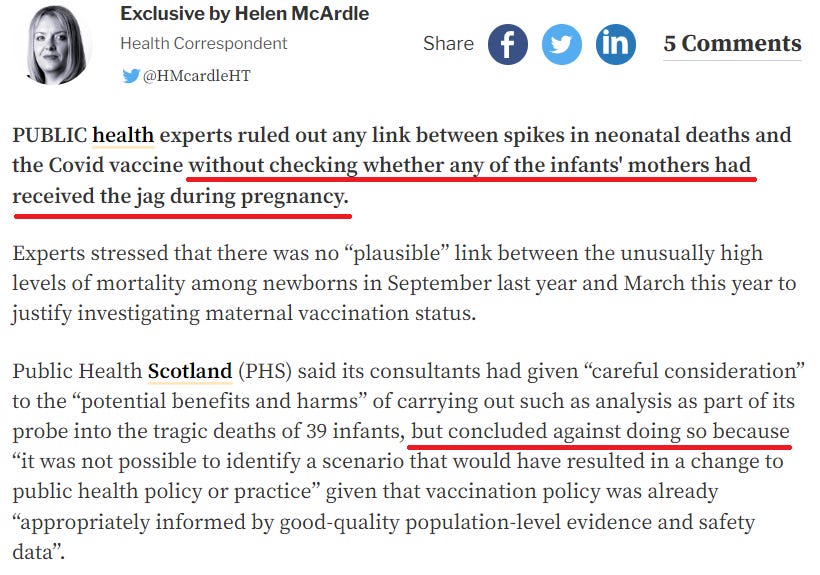
The Scotland government sets the industry gold standard here – this is how you do it, and with narcissistic pomposity to boot – they health authorities simply declared that the vaccines were not the cause of the sudden increase in neonatal deaths, without actually checking the vaccine status of any of the mothers.
The CDC very smartly also has yet to conduct a single autopsy of the thousands and thousands of deaths reported in the CDC’s own VAERS vaccine safety monitoring database. (Remember from Section I the part about adding absurd conditions to definitions? If you don’t, it’s best you review the material so that you have it on your fingertips.)
II-5. Publish only part of the data at first
Often enough, simply by publishing one part of the data and leaving out the other part for later, you can create a false narrative that takes root. So when you finally publish the rest of the data, it won’t matter that it contradicts the basis for what has now become accepted dogma.
For example, if you need to portray the Dreaded Disease as more widespread than it actually is, you could follow the lead of Virginia’s cutting edge propagandists and withhold some of the negative test results for a bit in order to raise the % of test results that are positive – which makes it seem like more people are sick with the Dreaded Disease:

Another scenario where you can utilize the partial data publication technique to great effect is where you find yourself forced to release data for whatever reason that will make the regime look really bad (it happens). So you want to delay the release of the really damaging stuff for as long as possible – if you wait long enough, it will eventually cease being relevant. Also, if you dump it all at once, the shock factor will be enormous and you will have a big mess on your hands. However, if you release the information drip-drip-drip, then by the time the scandalous pieces are released, the “wow” shock factor has already long since worn off, and people are not going to be paying as much attention anymore. This tactic was attempted by the FDA, although it was mostly thwarted by the rogue judge (emphasizing the critical need for judicial control to prevent renegade judges from going rogue on the regime):

II-6. Limit the acceptable sources of data or information
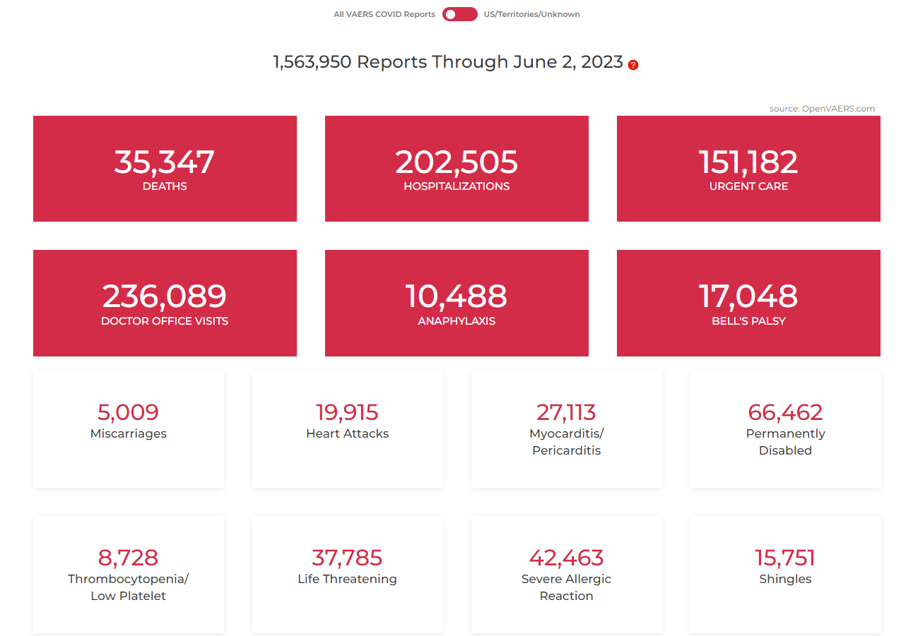
We’ll flesh this one out more in a later section on how to manipulate science in general. However, this point is germane to basic data curation as well. If there are sources that generate data inconsistent with the regime narrative, simply discredit them as propaganda or something else uncredible and dangerous, like Russian bots. Exhibit A would be the VAERS database run by the CDC. When VAERS showed utterly insane numbers of vaccine injuries by the covid vaccine –

Hinterlasse einen Kommentar